RENAISSANCE COLLECTION
The inspiration for our skeins comes from People of Color
in historical manuscripts and paintings.

This sumptuous red looks so luscious it can be described as tantalizing. The deepness of the red is given more depth with a touch of black which will add more dimension to your projects. The inspiration for this is from the 16th century artist Jan Jansc Mostaert and our inspiration in the painting may be Christopher le More.
The painting is entitled "Portrait of an African Man." c. 1525-30. Used with permission.


This mustard yellow will work up gorgeously on its own or you can pair it up with greys, blues, reds and more. The inspiration for this deep mustard shade comes from the image of Yasuke who accompanied Italian missionaries who traveled to Japan. Yasuke became closely acquainted with a leading Japanese figure Oda Nobunaga, and Yasuke served as a retainer and weapon-bearer for Nobunaga. This mustard yellow is a strong statement, perfecftly reflecting what was probably the first known Black Samurai.
The image comes from the Rinpa style ink-stone box (Suzuri-bako) from the 1590s. It is held in the Museo do Caramulo. Used with permission.

The light and airy powder blue is reminiscent of the attire of the figures in Jacob Claesz van Utrecht's Triptych image. These figures represent two helpers of Jesus, Nicodemus and Joseph of Arimathea, who assisted him during the crucifixion stage of his life. The soft blue will look wonderful on its own or paired with Blue Knight, greys or even, Pink Desert Moor or a soft yellow in Seafarerer's Sand in this collection.
The full painting is from 1513 and entitled Triptych with the Deposition from the Cross. Used with permission.


This colorway is a soft blush pink with slight variation in the skein to give it depth and dimension. The inspiration comes from the Italian painter Jacopo Ligozzi entitled "Moor of Barbary". This soft pink would will work superbly with Balthazar's gift from the Medieval Collection or even soft blues, greys or teals from the 1700s collection.
The sketch is held in The Uffiz,i, Department of Print and Drawings. Used with permission.
This light, sandy yellow color is for those who want a more muted but still vibrant yellow color. The inspiration were the tones of yellow and soft orange from this Black man's checkered outfit. He traveled great distances with the Portuguese to land in Japan where a Japanese artist painted this. The soft yellow will work up nicely on its own or pair it with John Blanke from the Medieval Collection or with greys or blues from the 1700s collection.
This image is from a folding screen seal of Kano Naizen (1570-1616), c. 1606. You can find more info here.


The stunning deep grey is a perfect neutral color for any project. You can pair it with Zamor's silver colorway in the 1700s Collection or even match it up with some blues, reds, greens, pinks or yellows. This is a perfect neutral color and will work up gorgeously in sweaters and hats. Inspiration comes from St. Maurice's gorgeous deep silver armor.
The manuscript image comesThe Pfirtsch Altar_ St. Maurice 1526 -30. Used with permission.

This jet black will go with any colorway and is a great neutral that will add depth to your projects. The lush and deep black is an essential neutral tone that will work so well on its own or mixed and matched with greys, warm or cool colors. Its rich and deep tone is inspired by Alessandro de'Medici (1510-1537) who was born to a Black mother, Simonetta da Collevecchio and his father was de facto ruler of the Florentine Republic, Lorenzo II de' Medici (1492-1519). Alessandro was the last Medici from the senior line of the family to lead Florence, and is known as arguably the first Black head of state in the West.
The portrait of Alessandro de' Medici was painted between 1534-1535 by Italian painter Jacopo Pontormo. The image is in Philadelphia Museum of Art. Used with permission.


Inspired by a 17th-century Italian painting by Luca Giordano, this coastal-sea palette is a gorgeous medley of soft blues and greens. The sage and lichen blend, along with some delphine blue is softened with an overlay of grey. It has a very soothing cool look that is reminiscent of the sea. It's a gorgeous variegated look that will work great as tops, socks, hats, blankets and more. You can even pair it up with Lichen-Sage, Delphine Blue or other solid and tonal colorways.
Image is open access. Painting by Luca Giordano. Saint Francis Xavier Baptizing Proselytes and Saint Francis Borgia, Italy (c. 1680s). Museo di Capodimonte, Naples.

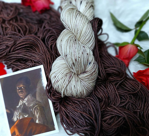
Neutrals are so versatile. Here we have an intense terracotta-like brown with orange undertones that reflect the robe that adorns Don Francisco de Arobe. Francisco was an Afro-Indian governor in Ecuador who was painted along with two of his sons to pay homage to him for his support for Spanish rule in 1599. His beautiful orange and brown robe inspires this tonal colorway that you can use on its own or pair up with a deep orange, red, green, black or even a gradient Theban from the medieval collection. The pairings are endless to create your own masterpiece. You can read more about Francisco here.
The portrait of Francisco comes from a larger painting entitled "The Mulatto Gentlemen of Esmeraldas" by Sánchez Gallque, Andrés, 1599. Madrid, ESP, Museo de América. Used with permission.


This colorway is exclusively made on a mernino/donegal (neon) yarn that has vibrant green, orange, yellow, and soft pink specks. The base color is a silvery grey that brings out the colorful specks but adds a neutral tone that will work great in lots of different projects from sweaters to hats, scarves, blankets and more. The blend is inspired by a gorgeous figure who is a steward hidden on the right of a 17th-century painting (c. 1687) by Italian painter Anton Domenico Gabbiani entitled "Portrait of Three Musicians of the Medici Court."
Public Domain image: Portrait of Three Musicians of the Medici Court by Anton Domenico Gabbiani, c. 1687.

This pastel medley has splashes of light sapphire and teal with light smokey grey and a dash of pale pink. A versatile, variegated colorway that is perfect for every season. You can use it on its own or mix it with some dark or light neutrals for an eye-catching piece. The colorway is inspired by King Balthazar's image in a 17th-century Flemish painter, David Teniers II the Younger’s “Adoration of the Kings.”
Sold to a private buyer. This figure is from 17th-century Flemish painter, David Teniers II the Younger’s “Adoration of the Kings.”


This beautiful softened turquoise has a slight teal tinge to it on one side of a skein and the other end is a soft tan. There is a light speckling of black and silver throughout just to give some dimension to your work. This beautiful colorway is based on Dom Francisco's son, Dom Pedro.
The portrait of Pedro comes from a larger painting entitled "The Mulatto Gentlemen of Esmeraldas" by Sánchez Gallque, Andrés, 1599. Madrid, ESP, Museo de América. Used with permission.

This foresty green tonal solid is a rich and deep green based on a 16th-century banquet image depicting a feast with many figures of color around a table. This green is taken from the figure in green, a deep woodlands green that is a rich pine color. Unlike the emerald shade, this color is much deeper and has bluer undertones. Think pine rather than gem.
Detail from the Gospel Lectionary of Herod's feast, Walters Manuscript W.535, fol. 159r from Walters Art Museum Illuminated Manuscripts. The manuscripts hand is Luke the Cypriot (1583-1625).
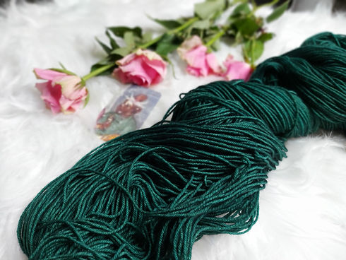


Based on a different Black figure at a feasting table that the colorway "Forest Feast" is from, this solid colorway is a deep and rich amethyst. The amethyst color is intensified and deepened to give you a richer color to work with. You can pair it up with some greys or other neutrals and it works gorgeously with navy and delphine blue. Have fun with this rich gemstone amethyst colorway that reflects the Black figure at a medieval feast!
Detail from the Gospel Lectionary of Herod's feast, Walters Manuscript W.535, fol. 159r from Walters Art Museum Illuminated Manuscripts. The manuscripts hand is Luke the Cypriot (1583-1625).

Inspired by a 17th-century Dutch painting by Hendrik Heerschop, this golden tonal colorway has slight variation with an intense gold that has lighter and darker variation with a slight splash of light sandy brown. The colorway is based on a gorgeous painting of King Caspar, one of the Black kings said to have visited Jesus in the nativity story. This beautiful warm colorway is great on its own but would work wonderfully with other warm, cool or neutral tones. It matches perfectly with Louverture Sapphire, Alessandro Midnight Black, any grey tones, reds, browns and gradient blends. This is really one of those colors you can mix and match with just about anything!
Painting by Hendrik Heerschop. Image in public domain but the original painting is in the Museum Kijker in the Netherlands.).


This colorway is based on a depiction of a popular figure in premodern art, the legendary St. Maurice. The colorway pulls together a deep silvery grey, malachite green, and fawn brown to create a cool variegated palette. The splashes of softened kelly green add a little pop of color amidst the greys and browns. It's a gorgeous blend that will work great as tops, socks, hats, blankets and more. The colorway reflects a fresh and bright woodland and would work well with a variety of solid and tonal colorways.
Manuscript description: German School, 16th century. Now in a private collection. Sold 2021 at Bonhams.

The figure of inspiration here is wearing a teal top but because he's in shadow, his outfit has lots of aubergine to reflect that. His gaze is on the main figure in Peter Paul Rubens' 17th-century painting but we have made him the focal point and taken him out of the shadow. The colorway has whisps of deep aubergine on a tonal deep teal and grey base. It's a rich colorway that will work great for lots of projects, especially sweaters, hats, mittens and socks. You'll get gorgeous results with this deep colorway.
Artist: Peter Paul Rubens, c. 1635. MS in Gemäldegalerie Alte Meister, Dresden. Image is public domain.


When your project or stash calls for a blue-grey, this is the yarn colorway for you. This blue-steel is like a dark metallic blue that has steely indigo/grey undertones to it. It's a solid colorway but a little tonal variation will add dimension to your projects. This colorway is inspired by the young pageboy in 16th-century Venetian painter Paris Bordone's "Portrait of a Gentleman in armor with two pages." The muted blue grey is perfect with neutrals, yellows, oranges, and even pinks.
Painted by Paris Bordone c. 1520s-70. The image is public domain and the original is held in the Metropolitan Museum of Art.
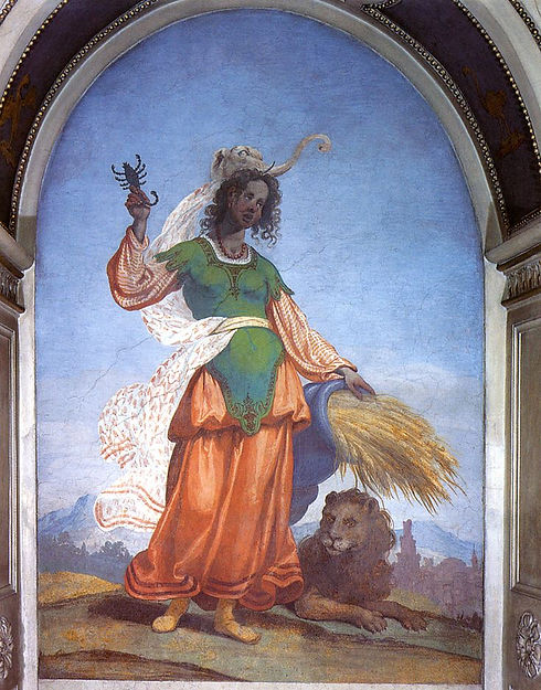
This colorway evokes the vibrant colors you would see in a tropical rainforest. The colorway is inspired by a 17thc image of a Black woman representing the continent of Africa in one of four personified depictions of the known continents during the Early Modern period. This luscious blend of teal/sage, peacock blue, and burnt/persimmon orange flows in and out of each other creating a rich palette that will work up with lively colors moving in and other of each other without muddiness. This colorway is versatile and will work for any season!
One of four baroque allegorical murals in the Astrological (Astronomical) Corridor of the Wallenstein Palace/Astrological Corridor in Prague, Czech Republic


A variegated field of fluorescent blue, hyacinth, and soft pink pulses with motion, cut through with hints of turquoise, vibrant pink and electric purple specks. Inspired by a late 16th-century Mughal illustration from the Darabname, this colorway reflects the charged energy of battle scenes rendered in jewel tones, where color carries drama, movement, and power. White breaks through the palette like flashes of light amid the clash.
A 16th century scene of Persians fighting against Africans – Mughal, India, c. 1580-1585. BL. Darabname Or. 4615, f. 29b.

The warm Autumnal colorway is inspired by a beautiful image of the Black magi, Balthazar, depicted in the Dutch artist Joos van Cleves' c. 1525 painting. The painting was originally attributed to Bernard van Orley but was uncovered to be a work of van Cleve in 2021. The colorway is short shifts of russet, deep persimmon, chestnut, gold, and rust which are laid carefully across the skein to ensure crisp colors that aren't over blended together. The colors in each skein are deep and warm reflecting Balthazar's attire. You can work with it on it's on to create a variegated palette or pair it up with soft speckled yarn like Speckled Rye or Sybil. You can even it out with a solid gold, russet red, brown or yellow or ivory color.
Image is Balthazar, the Moorish King by Joos van Cleve, c. 1525, located in Brighton & Hove Museum & Art Gallery.


Venetian Dawn is inspired by the Afro-Venetian figure in the commissioned painting by an unknown artist. His upwards gaze makes us think of the vibrant skies, so this colorway is like a beautiful rich Venetian morning. This beautiful figure draped in deep blue and gold is echoed in each self-pooling skein. The deep blue is a mix of sapphire, navy, and a touch of teal that fades out into a sunny gold tip. This is a perfect colorway for creative projects that will have a little burst of sun or stars in your sky palette.
Ducal commissione of Tommaso Morosini. c. 1590. London, BL.

Sybil is inspired by a prophetic figure from classical antiquity known for foretelling the future. Our figure of inspiration was created by painter Jan Boeckhorst in 1634. The base of each skein is a soft ivory and has warm brown specks like fawn, teddy bear and chestnut. Some of the specks create comet-like streaks to create longer bursts of color. This neutral tone works great with warm colors like reds, oranges, yellows and browns if you are doing colorwork. And it works great on its own as a soft palette.
Libische Sibille by Jan Boeckhorst c.1634. Musée des Beaux-Arts et d'Archéologie de Libourne.


This earthy toned colorway is inspired by the robe of Benedict of Palermo kneeling in the presence of King Louis IX of France, along with other figures like Francis of Assisi. Benedict of Palermo (also known as Benedict the Moor) was an Afro-Sicilian friar who devoted his life to charitable work. This is a semi-tonal color that has deep chestnut brown and espresso, with rusty persimmon undertones for dimension. It's a beautiful blend that won't look like a flat brown when you work with it as the little highlights of persimmon will pop through. This warm colorway will work well with practically any color, it's strong on its own for things like sweaters, scarves and hats but can be paired up as a dark tone for color contrast work.
San Francesco consegna il cordiglio a Luigi IX di Francia by Pietro Novelli. Originally painted for the church of Madonna di Monte Oliveto in Palermo, Sicily, c. 1635.

The figure of inspiration here is tucked into the shadows of Louis Le Nain's La Tabagie, a 17th-century painting of men gathered together in a smoky interior. While the other figures catch the light, our figure sits quietly in the background, his clothing taking on the deep, muted tones of the surrounding shadows. We've brought him out of the darkness and made him the focal point.
The colorway has a soft rye base with warm brown specks scattered throughout, giving it an earthy, slightly weathered feel. It’s a beautifully understated colorway with just enough speckling to give it character, and will work wonderfully for sweaters, hats, mittens, shawls and socks. It’s soft, warm and incredibly wearable.
Open access. Louis Le Nain's La Tabagie, 1643. Louvre, R.F. 1969.24.