
1700s COLLECTION
The inspiration for our skeins comes from People of Color in historical manuscripts and paintings.

A shimmery silver-grey tone that will work well as a gorgeous neutral tone or serve as a beautiful solid with accented variegated yarn. This colorway reflects the Bangladeshi Black boy Louis-Benet Zamor's splendid silver top.
Read more about this incredible French revolutionary here.
The painting is by Marie-Victoire Lemoine (French, 1754 – 1820), Portrait of a Youth in an Embroidered Vest, 1785. Cummer Museum. Used with permission.


Eleonora's Teal
(formerly Teal Elegance)
This near-solid shade draws from the rich teal of the silk dress worn by the woman who inspired the colorway. The fabric catches the light with a quiet luminosity, an elegant, saturated teal that will work up like a dream. Wear it on its own, or pair it with a silver, pinks, purples, creams or Tranquil Teal to create a harmonious blend of solids and soft gradients within the same palette.
Originally released as Teal Elegance when her identity was unknown, this colorway has now been renamed in honor of Eleonora Susette, whose name has only recently been rediscovered. What was once an unnamed presence in an 18th-century portrait is now recognized, allowing us to acknowledge her more fully, not just as a subject, but as a person.
The painting's artist is Jeremias Schultz who was most likely born in Berlin and ended up in The Netherlands. The former title of the painting is "Portrait of a Lady Holding an Orange Blossom." 1722/23. Used with permission.

The soft variegated colorway contains a muted green that has undertones of golden yellow to add depth and dimension. A beautiful green palette that would work up nicely if paired with Green Theban from the Medieval Collection or even a grey. The inspiration for Noble Golden Green comes from the "Portrait de Jeune Noir Avec Arc" (The Young Man with a bow), by the Catalan-French painter Jacint Rigau-Ros i Serra.
This portrait image is from c. 1697-1700. Used with permission.


Bellissimo Burnt Orange
The rich orange tone is a blend of burnt orange with a splash of pumpkin orange. The inspiration is pulled from this gorgeous portrait of this Black man by French painter Maurice Quentin de la tour. Why not pair it with Blue Knight or Domes Day Man?
Portrait is called "Portrait of a Negro Buttoning His Shirt." c. 1741. Musée d’Art et d’Histoire, Geneva. Used with permission.
This gradient yarn will give you a beautiful sapphire/teal colorway from a deep blue/teal that fades into a soft white. The inspiration comes from the French painter Francois Dagobert Jouvenet's portrait of "Le capitaine de vire-du-liron-de-montivers aux Indes". The little brown boy in the background is our inspiration and focal point. Taken from his homeland, we admire the inner strength he exuded even in this portrait.
This image is taken from here. It' was painted in 1750.


This simple neutral colorway is inspired by this beautiful African attendant of the princess of Zanzibar. Her name is unknown, but our attention is turned to her. The creamy off-white color is the perfect neutral that will go with just about anything and doesn't have the harshness of a plain white. Perfect for projects that call for or work with softer whites or off-whites that don't have strong yellow tones. There is a little variation in the skein to reflect the light hitting the more intense cream, which will give depth to your projects.
Portrait by Walter Frier, 1731. The extended painting that depicts two women was sold at auction to a private collector. Read more here.
The solid colorway is inspired by Don Miguel de Castro, Emissary of Kongo, c. 1643. The deep, earthy brown color with slight tonal variation for depth and complexity to the skein is a wonderful neutral tone. Beautiful on its own and even better paired up with gradients and speckled yarn.
Portrait in São Paulo Museum of Art. Used with permission.


This multi-tone colorway is predominantly light chestnut brown with a golden yellow addition that adds some dimension to each skein, and creates a warm caramel color. The complex colorway is completed with a slight burnt orange undertone. It's a gorgeous warm colorway that will work up wonderfully as sweaters, scarves, hats, and more. The inspiration is pulled from this little Black Page's jacket with shimmery golden lacework that borders the coat, and the deep orange reflected in their headwrap.
Painting attributed to the French painter, Antoine Pesne, c. 1710. The portrait is entitled: Portrait of a black page with a white parrot. Sold at auction to a private collector by Sothebys.

A blend of deep ecru and fawn create this wonderful neutral tone that will add warmth to your project without intense yellow undertones. Think creamy beige that is deeper than ivory. This colorway is inspired by one of several Black figures painted into Italian painter, Giambattista Tiepolo's 1744 painting. The figure's sandy brown tunic provides the inspiration for this warm neutral blend.
From the Banquet of Cleopatra by Giovanni Battista Tiepolo , 1744. National Gallery of Victoria in Melbourne, Australia. Used with permission.


Sometimes a project needs a slightly off-white color to add an extra richness and simplicity. This natural fiber is treated and washed, ready to be worked without any added color. You can either dye it yourself or work with it as a soft eggshell neutral to balance out any color whether it's a solid, variegated, gradient, or speckled. Our inspiration is taken from the rich but simple off-white robe, jacket, and turban that adorns this young Black man in a c. 1760s painting.
From the Italian painter, Alessandro Longhi's Portrait of a Young Black man, c. 1760s. In private collection.

This gorgeous earthy colorway is designed in a palindrome style so that the various green shades fade out on both ends to a tan and a light golden brown with hints of golden yellow. Each skein is comprised of deep foresty greens with a splash of kelly green as an undertone that blends out into the brownish tan. Think of a forest or pastoral land and this colorway is much like that. Great for sweaters, socks, blankets and more. This reflects the earthy tones of Pedro Sunda's outfit and his horn.
From KMS8 Ubekendt a portrait of Pedro Sunda, a Servant of Dom Miguel de Castro, produced between 1641-45. Used with permission.


Peach Blush
This soft peach solid color has a soft pink undertone. The inspiration comes from the late 18th-century "Portrait of a Young Woman" with her delicate peach dress and the soft light pink of her headwrap. The pretty pastel peach would work well with other warm colors like yellow, orange, pink, red, or neutrals like white, grey, or black. Perfect for blankets, sweaters, baby items, and toys.
Portrait is called "Portrait of a Young Black Woman." formerly attributed to Swiss-French painter Jean-Etienne Liotard. (mid 1700s). St. Louis Art Museum. Used with permission.

King Kaleb Burgundy
This is a deep burgundy solid tone inspired by the robe worn in a later depiction of 6th-century Ethiopian saint, King Kaleb (St. Elesbaan). The Brazilian painting from 1756 honors this incredible warrior king in his rich robe and saintly look. There is a light brown overtone to deepen the burgundy and give a more accurate comparison to King Kaleb's robe. This colorway is rich and great for all seasons. Make something on its own or pair it up with silvers, browns, and other neutrals.
Painting is from 1756 and was created to accompany Father Ginés Riquelme's novena (a worship & prayer service). The image is a Public Domain image.


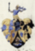
Armored Indigo
A gorgeous deep Indigo that's great for any season and works well with so many other colors, blues, pinks, greys, greens oranges, yellows and more! This tonal solid is a stunning color. It's an intense version of Candescence Indigo, if you want to pair up lighter and darker shades in the same family. This is inspired by a Black figure on a German coat-of-arms.
Detail from the Hofpfalzgrafen Coat of Arms. Heidelberg University Library, Cod. Sal IX. 58, f,115r (c. 1623-31).

The colorway is a beautiful soft tonal green with blue undertones on one side and a light flamingo pink that fades into the middle. It's a beautiful green/pink blend that will work up beautifully on its own or paired with other colors like black, grey, creams, pinks or even Pale Green Knight. Inspiration comes fro the 18th-century painting by German-born George Christoph Grooth's "Portrait of Empress Elizabeth Petrovna on Horseback with a Negro Boy."
"Portrait of Empress Elizabeth Petrovna on Horseback with a Negro Boy" by Georg Cristoph Grooth, 1743. Gallery, Moscow, Russia.


An additional blue tone is offered here with this beautiful and intense sapphire shade. Inspired by one of the leading figures of the Haitian Revolution, General Toussaint Louverture, this colorway is inspired by the rich sapphire blue jacket in a portrait. This beautiful cool colorway is great on its own but would work wonderfully with other cool or neutral tones like greys, black, browns, soft blues and even warm colors like orange or yellow.
"Color version of a 19th-century engraving of Toussaint Louverture. The original is in a private collection and you can find a color version here.

This peacock palette is inspired by a 1640 painting of the Black Magi, Balthazar, in David Teniers the younger's "Adoration of the Magi." This gorgeous colorway is dominated by a variegated blend of peacock blue, sapphire, teal, kelly green. Small random sections of golden yellow are toned down with a brown blend. This colorway is rich and will work up gorgeously on its own or with complimentary colors like teals, deep blues, golds, browns, creams and greys.
*Painting is in the Muzeum Narodowe of Wrocławiu: David Teniers the Elder: Adoration of the Magi, Antwerpen. Image is public domain.


The cool variegated colorway is a blend of very soft periwinkle, grey and a splash of black. This gives a smokey look where the colors move in and out of each other. The black is not overpowering, just enough to add some depth to your projects. This is a perfect colorway for anyone, and especially good for sweaters, cardigans, hats and socks.
The colorway is inspired by a 1633-34 painting by Peter Paul Rubens for a convent in Louvain.
*Painting is by Peter Paul Rubens and now held in King's College, Cambridge. Open access here.

An intense peacock blue with deep sapphire undertones based on an image of an Ethiopian emperor being visited by Portuguese Jesuits. The colorway is inspired by his regal robe, a rich color that will work so beautifully with almost any color from greens to oranges, pinks, neutrals, yellows, and reds.


This beautiful variegated blend of browns is full of warm earthy tones that will work up gorgeously. The deep espresso, flows in and out of a lighter fawn, softer chestnut brown and inflections of an ivory and ecru mix. Finally there is a little bit of smokey grey in there just to soften the colors. The woodland feel will make beautiful sweaters, hats, socks, mitts and more. It's one of those colors that will suit all skin tones as well, so the world is your oyster with this one. The colorway is inspired by the deep and light browns and soft golds in a 1640 Dutch painting of a young Black archer boy.
*Painting is by Govaert Flinck, a Dutch artist. The original work is held in the Wallace Collection in London, England. This image is public domain and found here.

Warmed Earth Embrace draws its palette from the quiet strength of the formerly enslaved couple in this 1879 Portuguese painting by Miguel Ângelo Lupi. It has softened lichen greens, weathered sage, and a grey overtone to tone down the colors. To give the yarn movement and depth on the needles, a warmer persimmon tone is gently amplified through the variegation, an echo of cloth, skin, and shared warmth, so the colorway opens up as it’s worked, revealing dimension without overpowering the calm at its core.
The painting is held in the collection of the Museu Nacional de Arte Contemporânea do Chiado in Lisbon


Inspired by the bronzed peach in this painting with a Black figure at a Eunuch's baptism, this colorway has a gorgeous golden peach undertone with an amethyst overlay that gives it a beautiful tonal shift that will add dimension to your project.